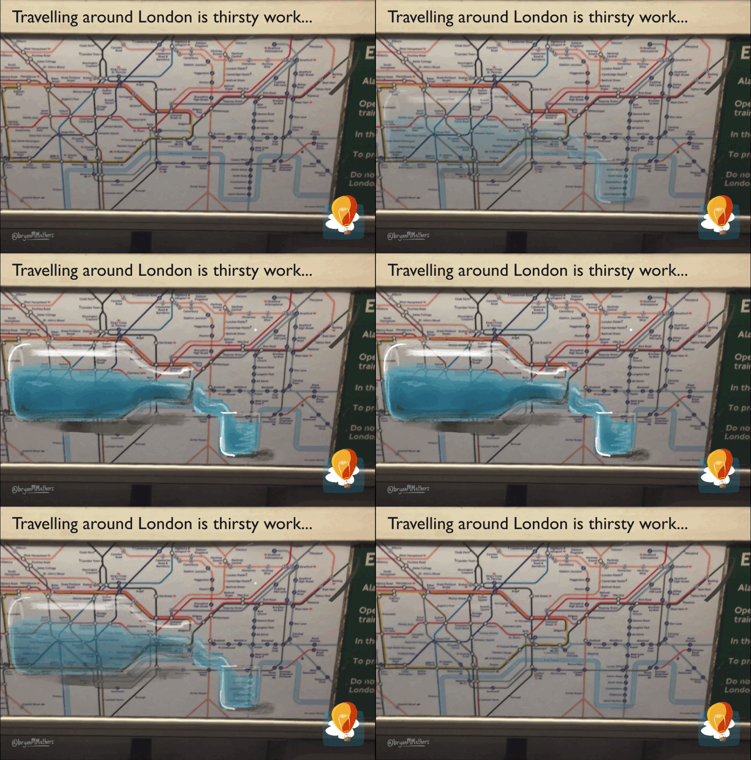
The London Underground map is a design marvel. It makes your paths straight. Just looking at it lightens your load. On seeing it for the first time (as a fresh-faced 20 year-old), I thought someone had intentionally worked a bottle shape into its design (essentially the outline of the Circle line.) After attending an excellent after-hours event at London’s Cartoon Museum this week, I saw the map I’m now so familiar with, and thought I’d use the Paper53 app on my phone to fill in that bottle. The bottle does seem more pronounced as the drawing disappears. But maybe that’s just my weekend eyes…

London Underground
London Underground
by Visual Thinkery is licensed under CC-BY-ND
You can use this image for free so long as you include the above attribution.